
And yes, the clown loach logo could use a re-vamp.
Wow, this is amazing! (plus **VISION**)
Moderator: LoachForumModerators
I like the earthy/neutral tone idea. Also like the SE Asian influence with the bamboo, etc. Don't like the heavy shadow effect on the main items, however. Makes the words difficult to read. Something a bit less heavy would be nice.
And yes, the clown loach logo could use a re-vamp.
And yes, the clown loach logo could use a re-vamp.
books. gotta love em!
http://www.Apaperbackexchange.com
http://www.Apaperbackexchange.com
-
Martin Thoene

- Posts: 11186
- Joined: Wed Dec 28, 2005 5:38 am
- Location: Toronto.....Actually, I've been on LOL since September 1998
Great post Martin!
1.) See my answer #1 above. Only moderators will have folders (or logins) at first. Later, we can see how things go.
2.) Yes, a moderator could create a page in their own folder (privately), and then move it to the public section when it's finished. But, I think when we're setting up the new site, EVERYTHING will be under development, so let's just develop it in its final location rather than have to move it all again once we're finished. (But, once we're open, being able to do private edits will be nice)
3.) I hate clutter. No matter what style we end up using, the front page will not be cluttered. But I like the image links on the left-hand side. It would be neat to have some kind of loach "browser" where a visitor could quickly narrow down to a couple of species by clicking on loach pictures separated by familes and body types. Right now, if your loach isn't on the main page, you have a very intimidating list of names on the species index to go through, with no help whatsoever in narrowing it down to a handful of likely names.
4.) I always liked that Clown Loach image...
Jeff
-
Emma Turner

- Posts: 8901
- Joined: Wed Dec 28, 2005 5:07 pm
- Location: Peterborough, UK
- Contact:
I'm still trying to get it to work for me...  From the sounds of everyone else's comments, it is just what we need.
Martin, I really like the bamboo idea, but for me, the colours are too subdued. I expect we'll all have different opinions on colour etc. I'm personally somebody who likes things brighter and bolder (probably too long working at a Paint manufacturers!), but I appreciate that not everyone is of the same opinion.
I really like the old clown loach logo - it is a LOL cornerstone!
Emma
Martin, I really like the bamboo idea, but for me, the colours are too subdued. I expect we'll all have different opinions on colour etc.
I really like the old clown loach logo - it is a LOL cornerstone!
Emma

East of the Sun, West of the Moon.
Neutral tones for content sections with bright/bold/darker colors in complimentary hues with deeper color saturation for framing or backgrounds would be the best of both worlds, I think. I agree that pages that are too 'light' are somewhat anemic and less interesting.
We will have lots of color provided by images alone, but on pages that are primarily textual content some darker accenting would be nice.
We will have lots of color provided by images alone, but on pages that are primarily textual content some darker accenting would be nice.
books. gotta love em!
http://www.Apaperbackexchange.com
http://www.Apaperbackexchange.com
-
Martin Thoene
- Posts: 11186
- Joined: Wed Dec 28, 2005 5:38 am
- Location: Toronto.....Actually, I've been on LOL since September 1998
OK, while you were all writing these comments I may have been picking up your karma or something. Here's texture and more richness. It's a rough idea. An actual page would need the centre(er) part lighter to an extent. I just couldn't find the right texture is all.
Due to it's size there's stuff I can't put in now. This is just an idea.
Jeff...what's the logistics of building something like this? I know you can get bamboo framing downloadable artwork.....I've seen it on sites.... just can't find it now. The leaves aren't essential and what I've drawn is way to angular anyway, but I think they might soften the angularity of it subtley.

A basic version of something similar to this with just the backround stone, textured centre part and the left bamboo pole could form a basis for our species profiles. If we could find something like a more subtle parchment texture it would not detract from text on top of it, but give a nicer feel than a stark, solid colour.
Love to hear comments and possibilities.
Jeff wrote:
Clown Loach
Botia types
Nemacheilines
Kuhlis
Other Eel-type loaches
Homaloptera types
Sucker-bodied Hillstreams
Oddballs
8 picture buttons could take you to other pages which could be subdivided.
Botia types for instance into True Botia, Sinibotia, Tigers, modesta Complex. How many stages is up to us. At some point though, clue pictures stop and there's a names list that are links to the profiles.
Also, there's an alphabetical listing based on Shari and Dan's database where each links you to the profile. That works for those who know what they're looking for.
Martin.
Due to it's size there's stuff I can't put in now. This is just an idea.
Jeff...what's the logistics of building something like this? I know you can get bamboo framing downloadable artwork.....I've seen it on sites.... just can't find it now. The leaves aren't essential and what I've drawn is way to angular anyway, but I think they might soften the angularity of it subtley.
A basic version of something similar to this with just the backround stone, textured centre part and the left bamboo pole could form a basis for our species profiles. If we could find something like a more subtle parchment texture it would not detract from text on top of it, but give a nicer feel than a stark, solid colour.
Love to hear comments and possibilities.
Jeff wrote:
Exactly the thoughts I had and we've discussed to an extent already. I think you can break it down to:It would be neat to have some kind of loach "browser" where a visitor could quickly narrow down to a couple of species by clicking on loach pictures separated by familes and body types. Right now, if your loach isn't on the main page, you have a very intimidating list of names on the species index to go through, with no help whatsoever in narrowing it down to a handful of likely names.
Clown Loach
Botia types
Nemacheilines
Kuhlis
Other Eel-type loaches
Homaloptera types
Sucker-bodied Hillstreams
Oddballs
8 picture buttons could take you to other pages which could be subdivided.
Botia types for instance into True Botia, Sinibotia, Tigers, modesta Complex. How many stages is up to us. At some point though, clue pictures stop and there's a names list that are links to the profiles.
Also, there's an alphabetical listing based on Shari and Dan's database where each links you to the profile. That works for those who know what they're looking for.
Martin.
Last edited by Martin Thoene on Sat Oct 28, 2006 7:27 pm, edited 1 time in total.
 Resistance is futile. You will be assimilated.
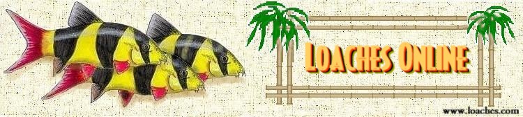
-
Jim Powers

- Posts: 5208
- Joined: Wed Dec 28, 2005 6:15 pm
- Location: Bloomington, Indiana

-
Emma Turner
- Posts: 8901
- Joined: Wed Dec 28, 2005 5:07 pm
- Location: Peterborough, UK
- Contact:
-
Martin Thoene
- Posts: 11186
- Joined: Wed Dec 28, 2005 5:38 am
- Location: Toronto.....Actually, I've been on LOL since September 1998
I think I'm hearing a general concensus hereJim Powers wrote:Very nice!
I still think you need to use the Clown Loach logo. Its an identifiable part of LOL.
It's got to face into the site though. The one on "Loachbase" looks like it's leaving
Martin.
Resistance is futile. You will be assimilated.-
Mark in Vancouver
- Posts: 14252
- Joined: Wed Dec 28, 2005 12:41 pm
- Location: British Columbia
Nice mockup Martin. Sure, it's possible to do something like that on the new site. I've looked at other sites using Plone and it appears to be infinitely flexible (depending on how much work you put into it), so I'll keep your design in mind when I'm looking for templates to use to give us a head start.
Let's talk about what needs to go on the front page, so that I can quickly create these sections when I lay out the new site. What section links does everyone think are important to have on the main page?
Some of the most crucial / obvious are:
* Species Index (most important spot on the page; with some nice pictures to help people narrow down quickly)
* Forums (probably second-most important location)
* Search box
* News box with recent site updates
Other possible candidates (that I've seen on Martin's mockup and elsewhere) include:
* Links
* Disease & Treatment (or just "Disease")
* FAQ
* Housing
* Feeding (or just "Care" if we combine housing/feeding?)
* Gallery (Can have the Loach Portraits that already exist, plus a big link to http://www.loachtank.org/ for people to post their own photos)
* Articles (generic section for everything else)
* About Us (Lists all of the moderators who built the site, describes how we're open to new moderators by invitation only if they're already active on the loach forum and would be good team players).
Let me know if you have other ideas about what the main sections of the site should be (and what they should be called). Again, I'd like to talk about this now, so when I get access to the new server I can just plug these in ASAP.
Thanks!
Jeff
Glossary?
To avoid clutter on the main page could we have an 'articles' link and place things like care/feeding/diy/tank building etc there?
To avoid clutter on the main page could we have an 'articles' link and place things like care/feeding/diy/tank building etc there?
books. gotta love em!
http://www.Apaperbackexchange.com
http://www.Apaperbackexchange.com
-
Martin Thoene
- Posts: 11186
- Joined: Wed Dec 28, 2005 5:38 am
- Location: Toronto.....Actually, I've been on LOL since September 1998

Clowns should be in groups right? If you all like one Clown, then more must be better.
* Species Index (most important spot on the page; with some nice pictures to help people narrow down quickly) YES
* Forums (probably second-most important location) YES
* Search box YES
* News box with recent site updates CAN THAT BE ONE OF THE CENTRAL AREA LINK GRAPHICS? - GO TO ANOTHER PAGE WITH DETAILS?
Other possible candidates (that I've seen on Martin's mockup and elsewhere) include:
* Links
* Disease & Treatment (or just "Disease") BOTH IS GOOD IF THERE"S SPACE FOR TEXT
* FAQ YES
* Housing
* Feeding (or just "Care" if we combine housing/feeding?) TO AN EXTENT, THAT'S THE LOACH ALMANAC, BUT I THINK IT'S TIME FOR A RE-WRITE
* Gallery (Can have the Loach Portraits that already exist, plus a big link to http://www.loachtank.org/ for people to post their own photos) YES
* Articles (generic section for everything else) YES
* About Us (Lists all of the moderators who built the site, describes how we're open to new moderators by invitation only if they're already active on the loach forum and would be good team players). NOT A BAD IDEA THAT. I'M NOT SHY

Click on a profile and get something like this (text would be a lot smaller, this is just for the idea):
 Click on next and go to more pictures and info. Subsequent pages have Back and Next buttons.
Martin.
Resistance is futile. You will be assimilated.-
Graeme Robson

- Posts: 9096
- Joined: Wed Dec 28, 2005 4:34 am
- Location: Peterborough, UK
- Contact:

Just a quick update: The account on the new server was created today and I've got a working Plone website running. Everything seems to be going smoothly so far. I'm going use my "free time" this week to customize the site and upload a few species descriptions from the forum for practice. Then I'll open things up to the moderators this weekend and let you make a few pages yourself and see how things go.
Note: Has anyone else upgraded to the new free Firefox 2.0 web browser? ( http://www.mozilla.com ). It has an integrated spell check that works on any website. It looks like Microsoft Word and puts red squiggly-marks underneath misspelled words. I think it would be *great* if everyone used this browser when working on Loaches Online; especially me!
Thanks,
Jeff
Who is online
Users browsing this forum: No registered users and 3 guests